UI enchancement
UX design
CRO
B2C
Interaction Design

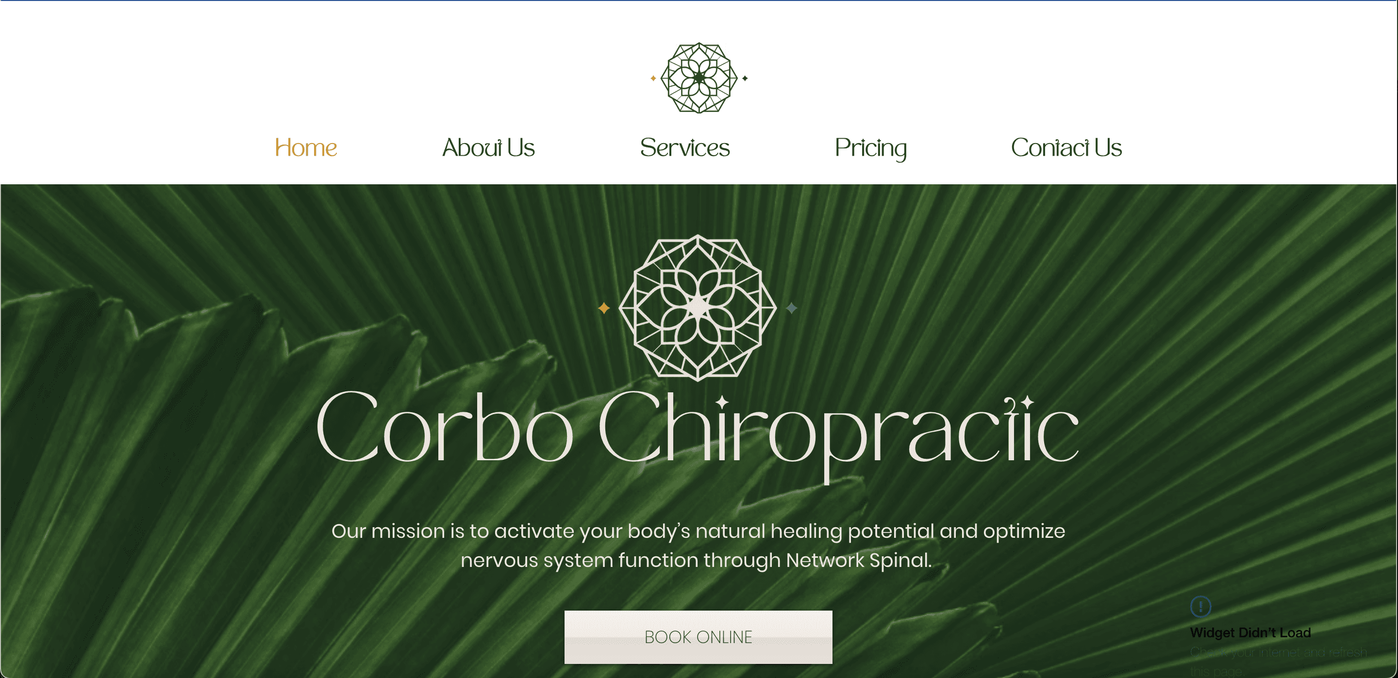
Index

Design decisions & rationale
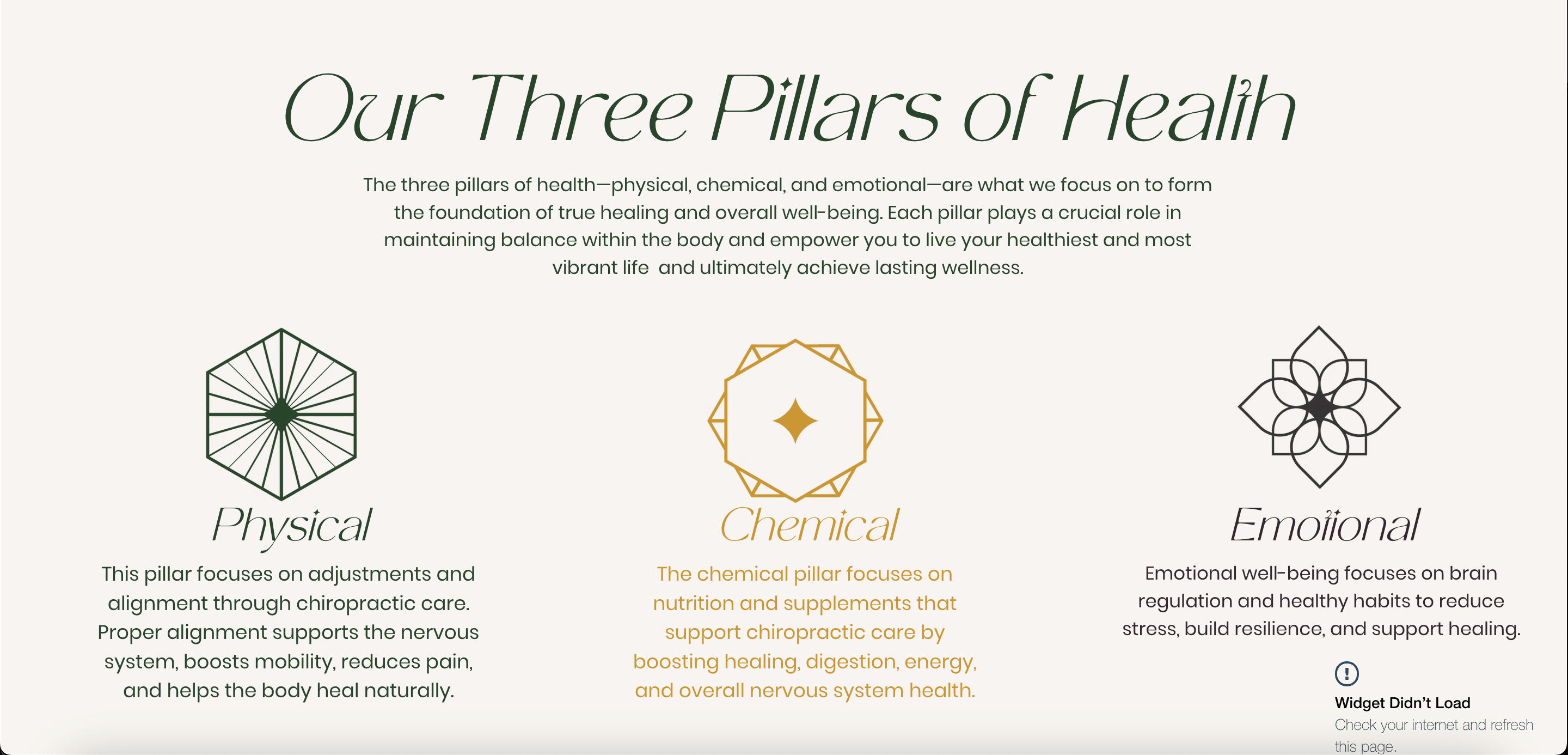
Pain Point: Information Overload
One of the main challenges that the clinic had is having an overwhelming amount of content. The more the better was definitely their motto.
The trick was to redesign and restructure information and layout in such a way that it would have just enough amount of content to ensure:
01
spark interest about the services for new and existing clients
02
set the right expectations about the service
03
provide education information WITHOUT the long scrolls and multiple pages that feel overwhelming
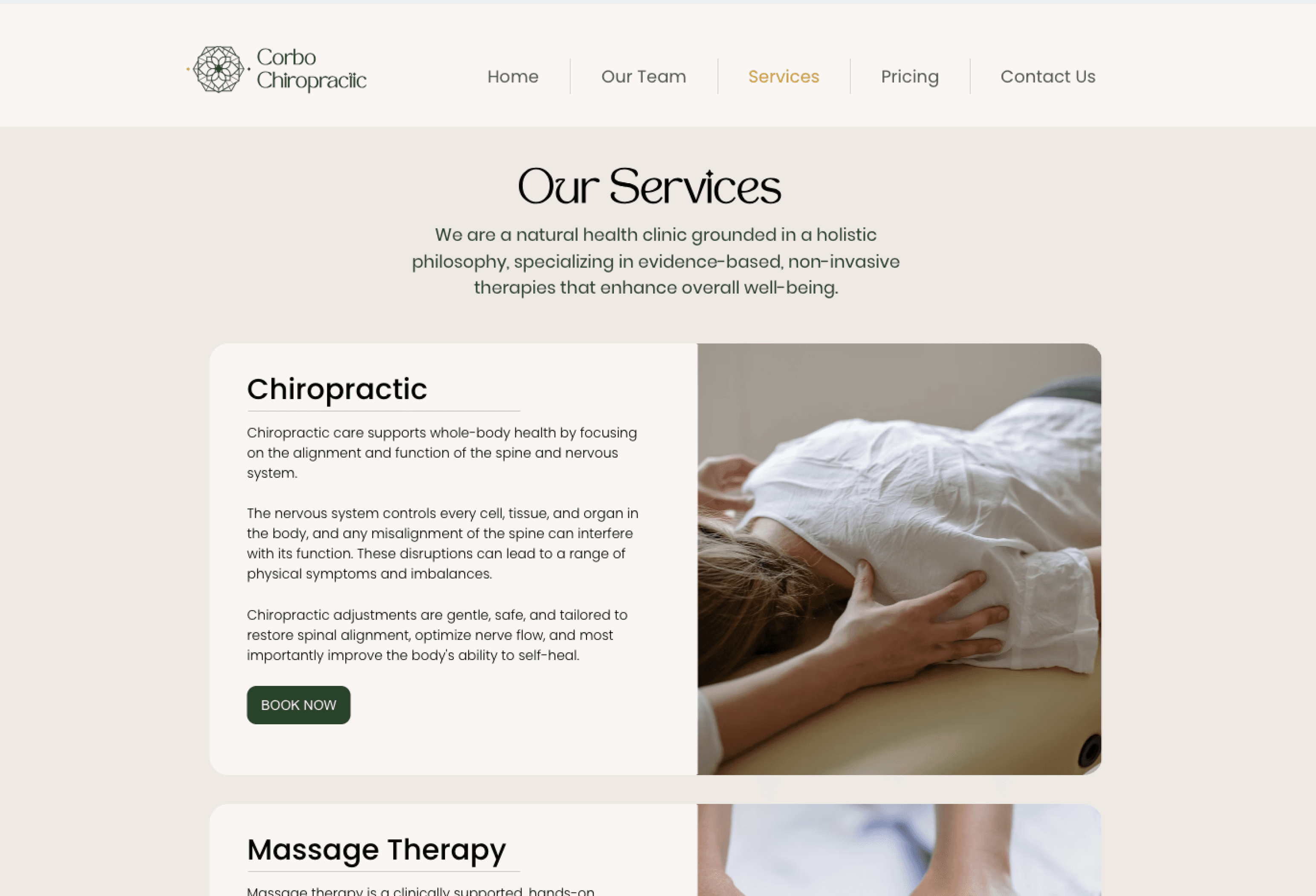
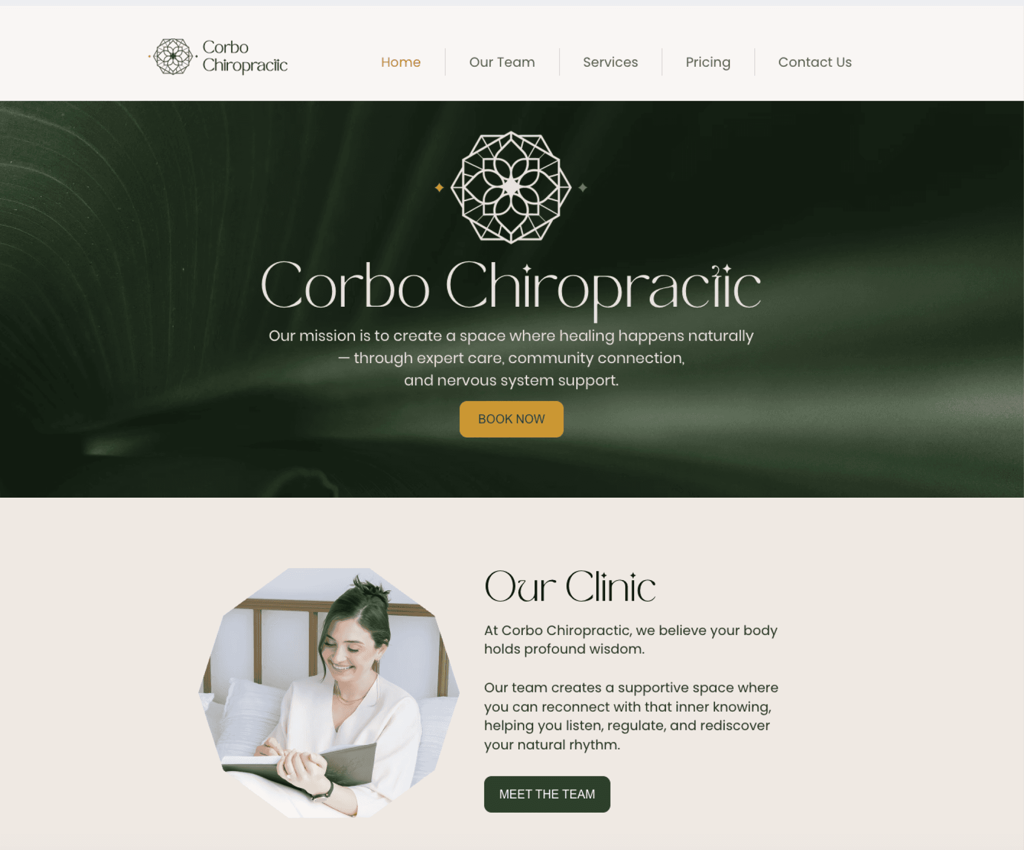
"Services" page before the redesign
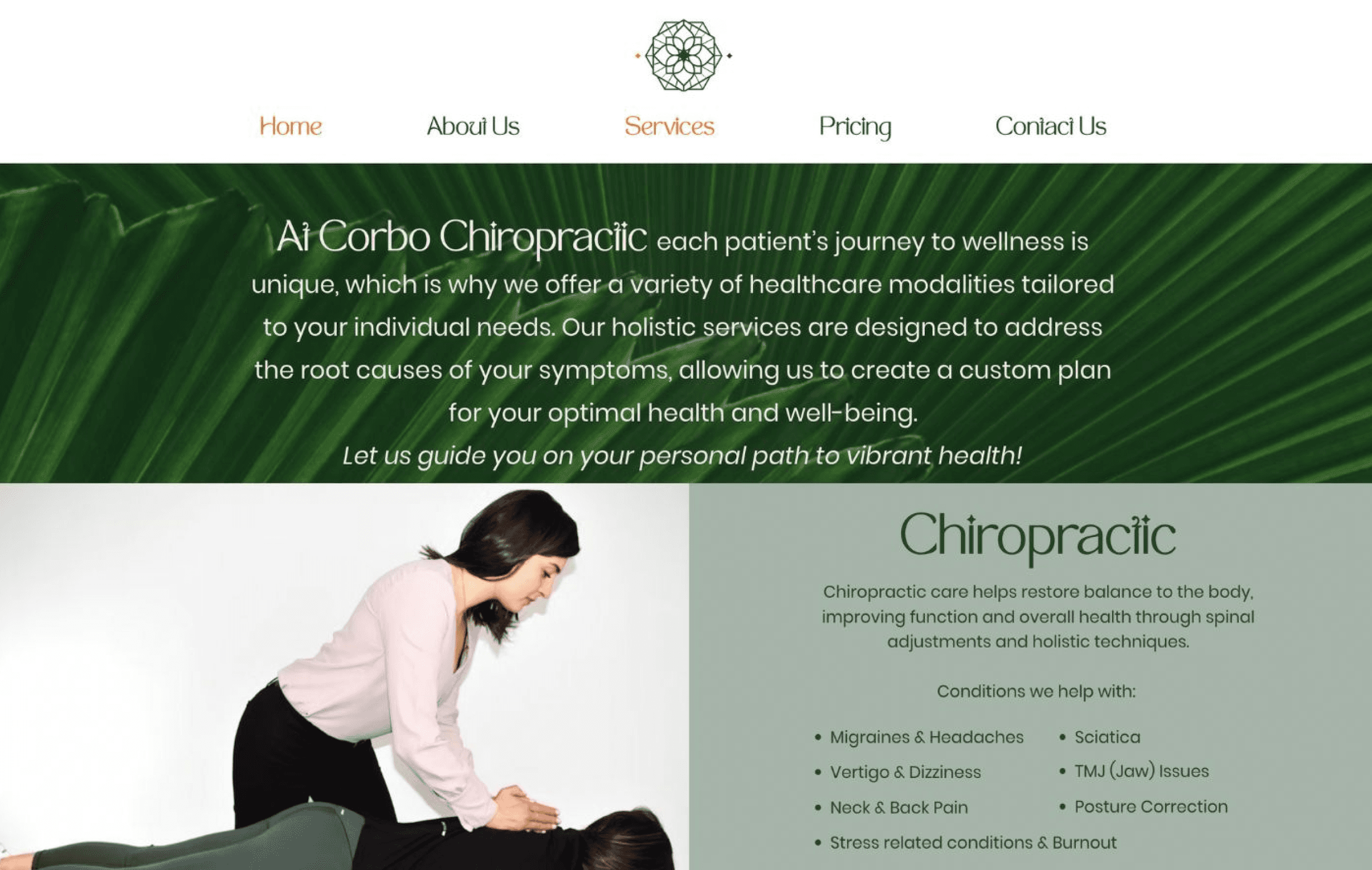
I took the route of simplification, and decided to get rid of a separate page for each service, nested under Services tab in menu navigation. It was creating a disconnected experience with the actual Services pages that already contained a lot of content about each service.
This is how the Services page looked before the redesign.
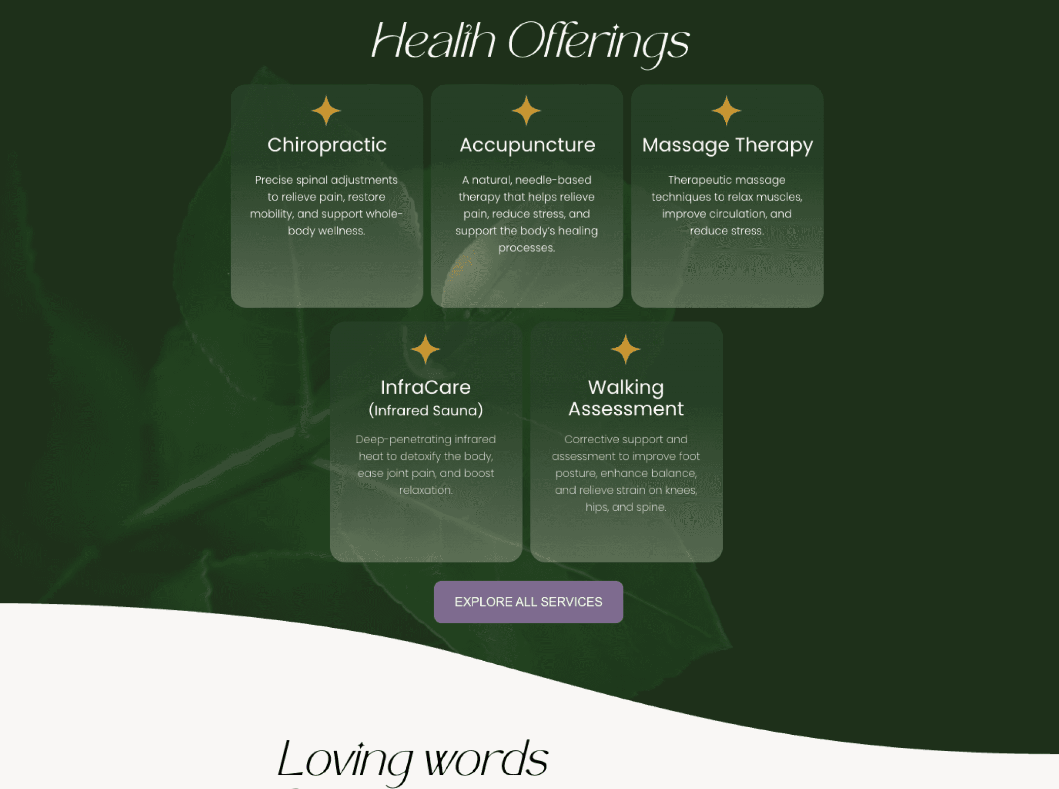
Design decision highlight
Interactive cards for content restructuring
Preserve some white space on the page by nesting extra information within the hover interaction (see video above)
Improve readability and reduce cognitive load through a quicker scroll and grouping of information based on Gestalt principles of proximity and similarity, while preserving the most essential content and information
Ensuring visual consistency (with colours, font, size and shape of each card) further strengthening the link between different cards and their belonging to the same category - Services


Objective #1
Preserving brand identity to ensure continuity, intuitiveness and brand recognition
A little bit of strategy
Objective #2
Creating a timely unfolding CTA strategy that guides users' on the journey - ensures smooth wayfinding outside of the direct navigation points


Some of the obvious changes I have implemented were:
Readable typography — scaling down font sizes
Appropriate spacing - enough padding/margins for comfortable reading and visual hierarchy
Touch-friendly buttons - ensuring buttons and links sized at least 44x44px for easy tapping
Challenge
Translating an interactive web element into a mobile design that is intuitive and functional
The interactive cards carried one very important function - allowing for more space on the page and shorter scroll, while ensuring the user can easily get more information about a given service (through a hover interaction - see GIF below).
Translating this functionality to mobile was especially challenging because of the technical limitations within the older Wix Editor that the site is built on.
solution
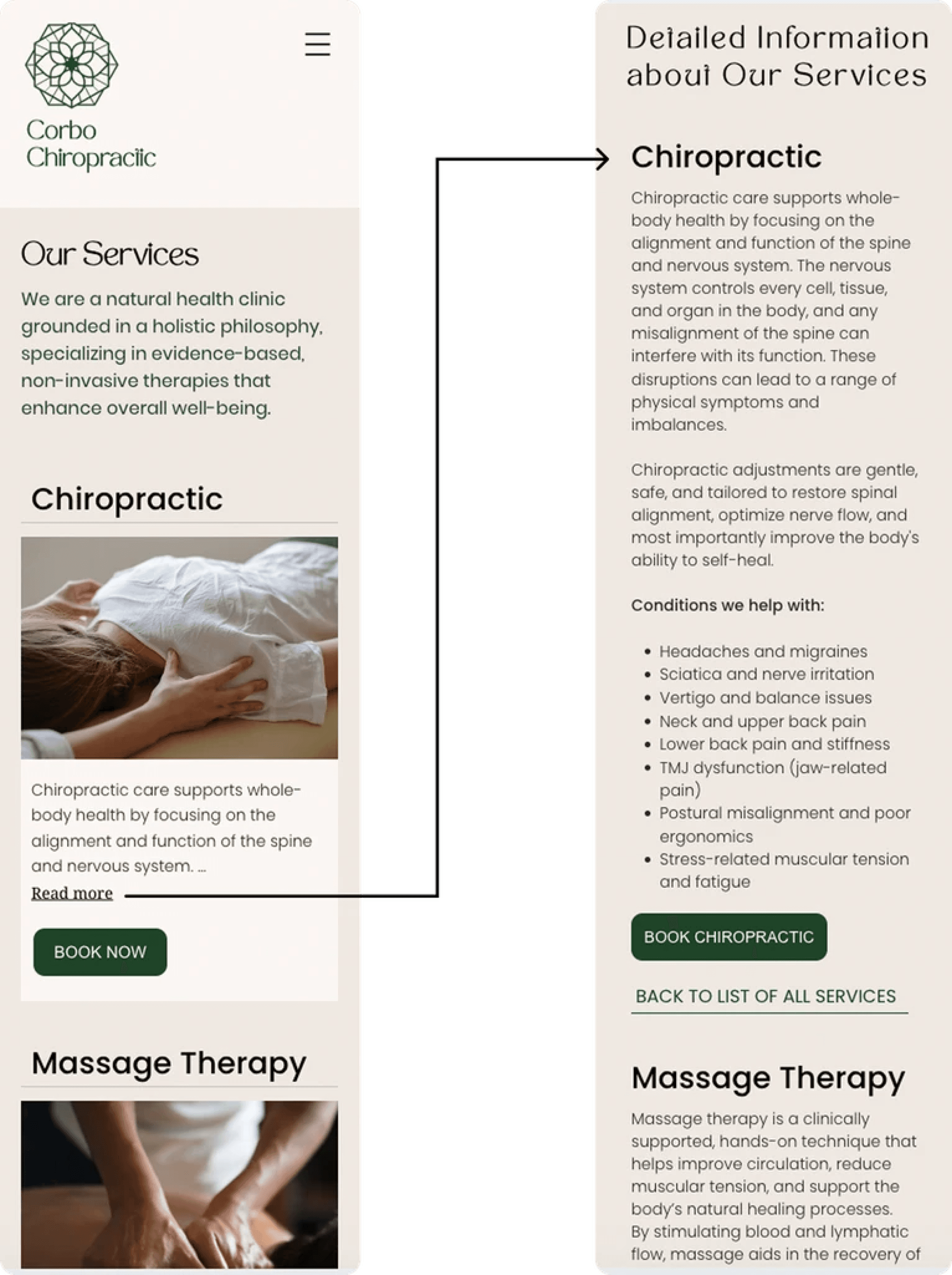
Re-prioritization of the content hierarchy
In order to preserve shorter scroll and ensure one card fits into a single screen, I have decided to shorten the information displayed. The 'Read more' link would take user to the bottom of the page where I added a "Detailed Information" section which contained all the information from the card and hover states in web.
Such content hierarchy with the supporting links for the easy navigation from top to bottom of the sections, would allow user to easily get more information about the service without having to scroll through all the content for each service. Similarly, it would allow the users who are not interested in the additional information to find the booking link for the right services within seconds of landing on the Services page on mobile.
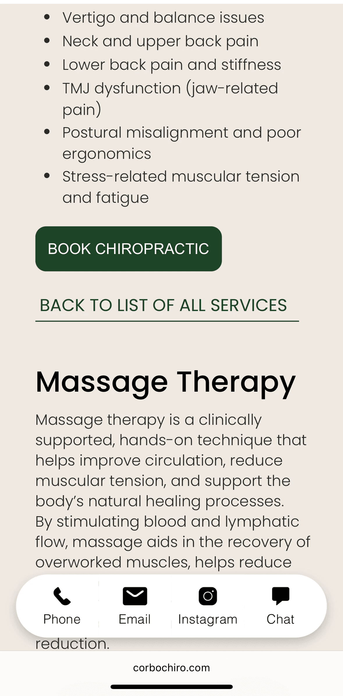
Buttons: 'Book Now' vs 'Book Chiropractic
In the "Detailed Information", I have opted in for the booking button that features the name of the specific service, particularly because:
— the information about the single service doesn't fit into one mobile screen and requires a scroll.
Not having sight of the service title, users might get confused and click on 'Book now' for the wrong service. "Book Chiropractic" helps to reiterate to the user where exactly they are located on the page and supports wayfinding.
9:41
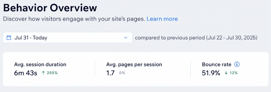
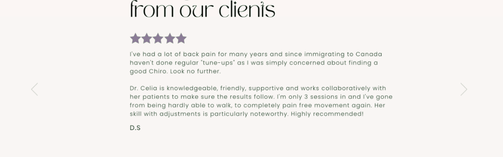
Results
More engaged visitors that stay for longer and drop off less
255%
increase in average session duration
12%
decrease in bounce rate