Pet Smart
UX audit meets competitor analysis in a Product Page redesign
UX audit meets competitor analysis in a Product Page redesign
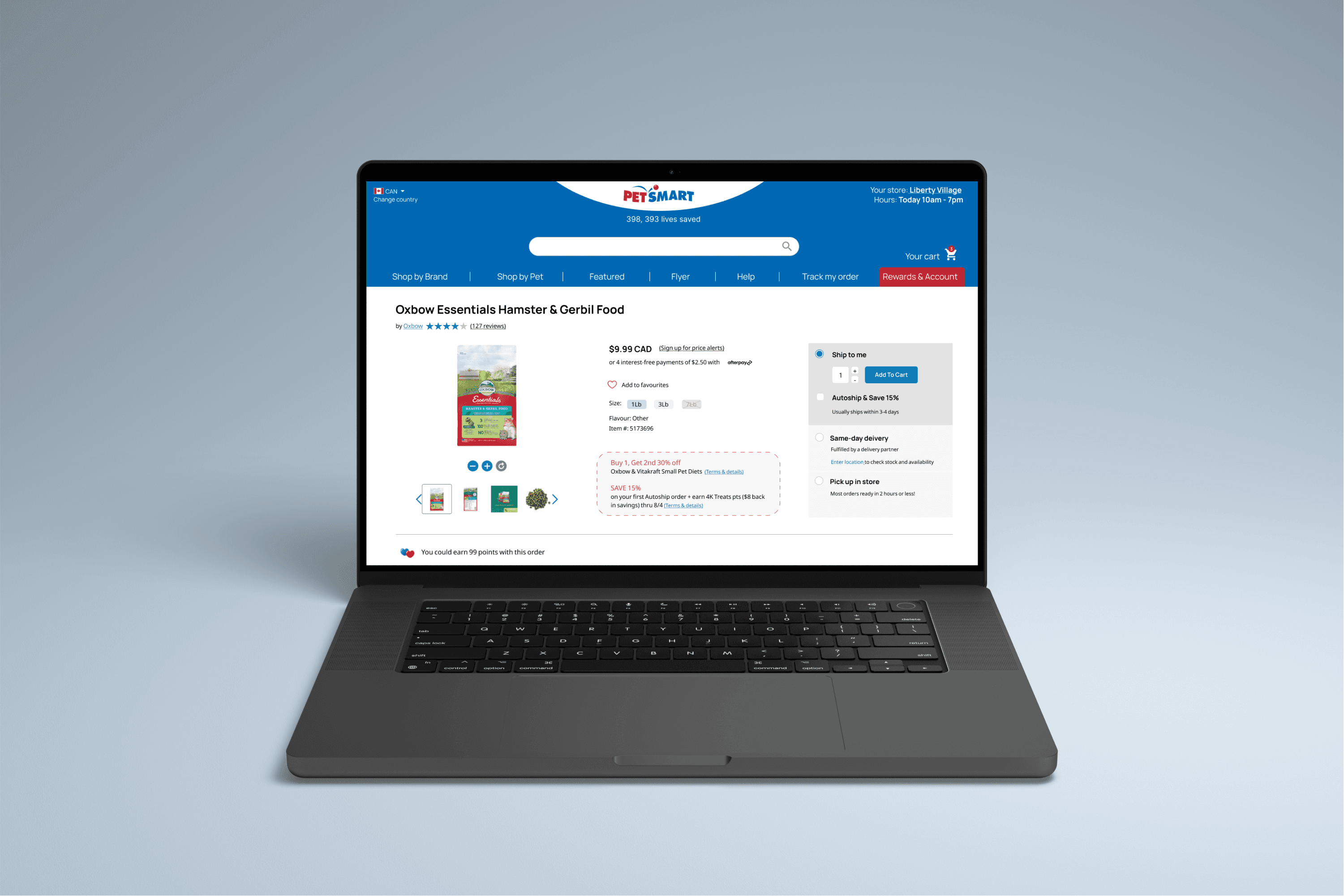
A product page redesign for PetSmart focused on resolving key user pain points and highlighting the brand’s unique value. Backed by comprehensive research, the final design strengthens clarity, trust and conversion potential.
A product page redesign for PetSmart focused on resolving key user pain points and highlighting the brand’s unique value. Backed by comprehensive research, the final design strengthens clarity, trust and conversion potential.
UX reseach
Usability Testing
UX design
Competitor Analysis
Interaction Design
Business impact at every step
While this redesign may seem minimal - it only involves one page and very little visual uplift, the UX improvements don’t only provide better experience for users but also have significant business impact.
01
01
Research approach
Conducting competitor analysis in conjunction with user research to prioritize pain points that elevate Pet Smart's strategic positioning
02
02
Design decisions at conjunction of user needs and business value
Elevating Pet's Smart competitive advantage (Same–day Delivery option) through clear visual hierarchy and improved user flow
03
03
Conversion focused UX
Accelerating customer journey through decision making stage, by visually highlighting the most important information and reducing confusion through intuitive design and readability enhancement
Problem definition
Problem definition
How I chose what user flow to focus on
How I chose what user flow to focus on
User research
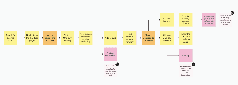
Ideally, I always let the user research lead the problem definition and this case was no different. Research illustrated some major pain points in the flow and the potential consequences of existing friction, such as customers choosing the wrong delivery method by mistake and realizing after the order has been placed.
Ideally, I always let the user research lead the problem definition and this case was no different. Research illustrated some major pain points in the flow and the potential consequences of existing friction, such as customers choosing the wrong delivery method by mistake and realizing after the order has been placed.
User research

Strategic business impact
What makes the pain points critical — apart from frustration they cause for the user —is their immense impact on the business (from failing to convert visitors to new customers, to losing existing customers to poor experience).
This is especially true for the Add-to-Cart and Checkout user flow. On the journey map above, I have identified a few areas of major frustrations for users (eg. where they are asked to re-enter the same information over and over again). Not solving these pain points can havea a direct negative impact on conversion rates, but it also means the company is currently running operations costs in resolving the aftermath of wrong orders.
Strategic business impact
Competitive advantage
Pet Valu, which is Pet Smart's direct competitor, has 3x more stores than Pet Smart in GTA (Toronto, Canada) area.
Pet Valu makes its products accessible to the customers in a time sensitive manner through in-store sales and pick-up options. User research confirmed that getting products fast was in fact an important factor in choosing, which pet store to buy from. By providing Same–Day delivery service, Pet Smart holds a competitive advantage in this regard.
I have validated this finding further by conducting a competitive analysis that specifically analyzed retention and convenience factors.
Competitive advantage
UX audit:
Pain points overview
UX audit: Pain points overview
petsmart.ca
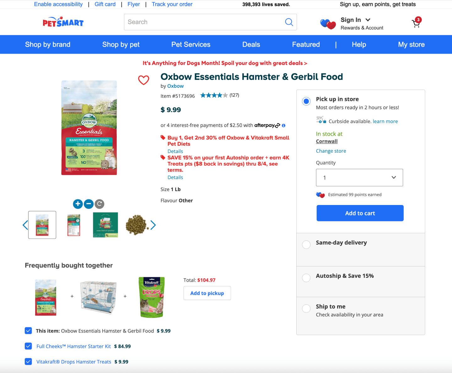
Pain point #4
“Add to favourities” icon
Positioning makes it unclear, if icon allows for interaction
Blends in with other elements and same colour (red) text on the page
Current positioning at the top - before the product information, would require user to navigate back to the top
Pain point #1
Product information
Poor readibility because of the red colour overuse and poor text hierarchy
Doesn't meet accessibility standards
Pain point #2
Delivery options - Layout
Doesn’t display important information for quick decisions making
Poor visual hierarchy. The use of multiple text styles/colours makes the information hard to scan text
Pain point #3
Bundle items card
Potential confusion due to positioning
Not clear which item belongs to which label
Button is only suitable for one use case (one type of delivery)
Pain point #4
Pain point #4
“Add to favourities” icon
Positioning and unclear if icon allows for interaction
Blends in with a lot of other elements and text that are red on the page
Location prior to the product information would require user to navigate back to the top
Pain point #2
Pain point #2
Delivery options - Layout
Doesn’t display important information for quick decisions making
Poor visual hierarchy. The use of multiple text styles/colours makes the information hard to scan text
Pain point #3
Pain point #3
Bundle items card
Potential confusion due to positioning
Not clear which item belongs to which label
Button is only suitable for one use case (one type of delivery)
petsmart.ca
petsmart.ca


Pain point #1
Pain point #1
Product information
Poor readibility because of the red colour overuse and poor text hierarchy
Doesn't meet accessibility standards
If everything is important, nothing is
Readability is one of the most critical factors in User Experience. It ensures the user can actually easier understand the information presented.
Good readability reduces the cognitive load required to process information and in that way indirectly assists with decision making process.
In case of Pet Smart, using too much emphasis on certain elements (such as coupons) actually takes away emphasis.
The lack of proper text hierarchy increases the need for user to read through all the text and makes it harder to find specific information the user might be looking for such as size.

"Add to pickup" button next to the Bundle Items card assumes that user is only interested in one delivery method and requires them to pay close attention if they do want to change it at the check out.
Ooops.
Wrong order anyone?
Placing a wrong order is a critical point in user experience and their journey as a customer (potentially a breaking one), especially if it happens due to poor and unintuitive UX.
It puts pressure on customer support to ensure quick resolution. If the volume of wrong orders increases, so do the operational costs as well as the ability to resolve those issues in timely way.
Minimizing confusion is key and goes hand in hand with maximizing intuitiveness.
The requirement for detail orientedness of the user doesn't stop here. The positioning of product images and names separately from each other also requires user to pay attention, read closely the product names and at times decipher which product belongs to which (especially with those that have similar imagery as a lot of pet food products do).
Unclear interaction paths
Interactive elements that don't signal a clear indication of their interactiveness become redundant. This is the case here, partly because of the positioning of the Add to Favourites icon but also its size and style.
The positioning of the icon is also important as needs to be located at the right point of the user journey. Namely, it doesn't make much sense to place 'Add to favourites' icon at the very top of the page, when the user hasn't yet had a chance to read through some of the product details.
Intuitiveness is again important here and Jacob's law applies well. Whereas the chosen icon and lack of signifying text mirrors familiarity of Instagram and other social media apps, it is not well suited here. Firstly, website requires a different interaction, and secondly the page is already very crowded with various elements.
Commonly, in the web design the heart icon accompanies the text 'add to favourites', or even at times, 'to add to 'wish list', depending on the relevant context.
If everything is important, nothing is

Readability is one of the most critical factors in User Experience. It ensures the user can actually easier understand the information presented.
Good readability reduces the cognitive load required to process information and in that way indirectly assists with decision making process.
In case of Pet Smart, using too much emphasis on certain elements (such as coupons) actually takes away emphasis.
The lack of proper text hierarchy increases the need for user to read through all the text and makes it harder to find specific information the user might be looking for such as size.
Ooops.
Wrong order anyone?

"Add to pickup" button next to the Bundle Items card assumes that user is only interested in one delivery method and requires them to pay close attention if they do want to change it at the check out.
The requirement for detail orientedness of the user doesn't stop here. The positioning of product images and names separately from each other also requires user to pay attention, read closely the product names and at times decipher which product belongs to which (especially with those that have similar imagery as a lot of pet food products do).
Placing a wrong order is a critical point in user experience and their journey as a customer (potentially a breaking one), especially if it happens due to poor and unintuitive UX.
It puts pressure on customer support to ensure quick resolution. If the volume of wrong orders increases, so do the operational costs as well as the ability to resolve those issues in timely way.
Minimizing confusion is key and goes hand in hand with maximizing intuitiveness.
Unclear interaction paths

Interactive elements that don't signal a clear indication of their interactiveness become redundant. This is the case here, partly because of the positioning of the Add to Favourites icon but also its size and style.
The positioning of the icon is also important as needs to be located at the right point of the user journey. Namely, it doesn't make much sense to place 'Add to favourites' icon at the very top of the page, when the user hasn't yet had a chance to read through some of the product details.
Intuitiveness is again important here and Jacob's law applies well. Whereas the chosen icon and lack of signifying text mirrors familiarity of Instagram and other social media apps, it is not well suited here. Firstly, website requires a different interaction, and secondly the page is already very crowded with various elements.
Commonly, in the web design the heart icon accompanies the text 'add to favourites', or even at times, 'to add to 'wish list', depending on the relevant context.
Competitor Mapping and Analysis
Competitor Mapping and Analysis
I have started the competitor analysis by mapping out the biggest players in the Canadian pet market: Ren's Pets, PetValu and Chewy.
Next, I've used the pain points and features, that I have identified from Pet Smart's product page, to analyze specifically both the 'how' and the 'what' of the competitors. Namely, I first looked at whether the competitor even has a similar offering (marked with a grey tick or cross).
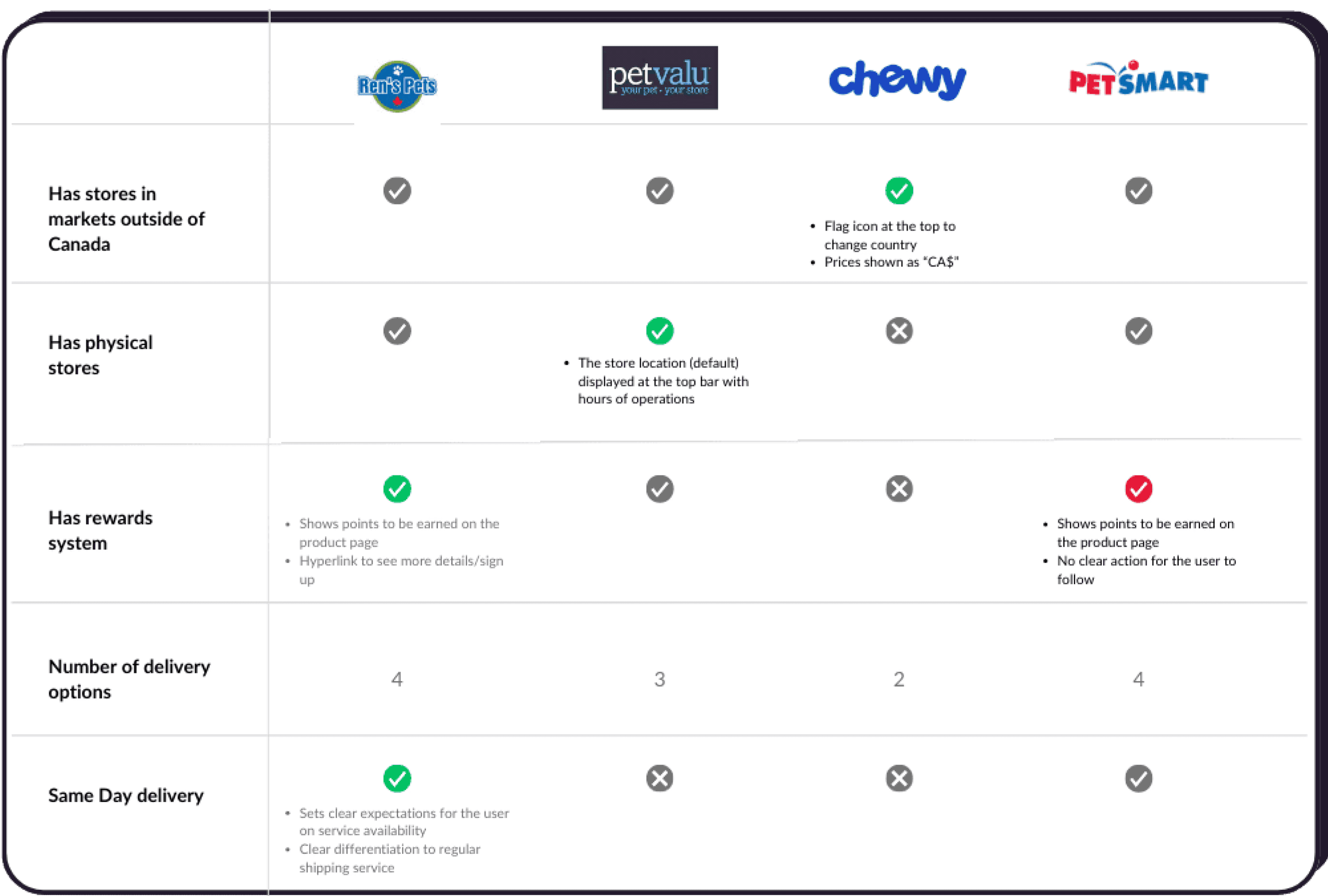
Afterwards, I have analyzed the 'how' of this offering within their digital presence. If the UX of the offering is positive, I marked it with a green tick; if negative - with a red one.
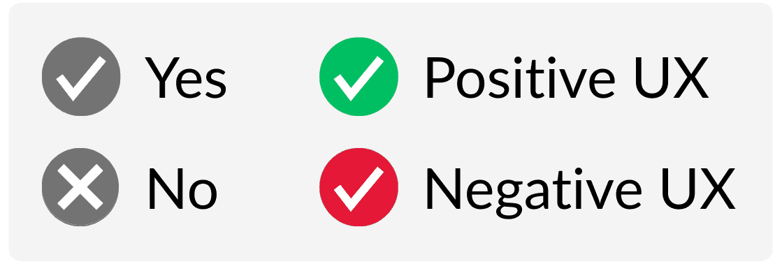
I have used the positive UX from competitors as an inspiration to designing the solutions for the similar pain point that Pet Smart has.
For instance, while all the identified competitors operate in markets outside of Canada and have very similar websites, only Chewy tried to create a design that immediately locates its customers in Canada by doing 2 things:
having a flag icon
showing prices as CAD$
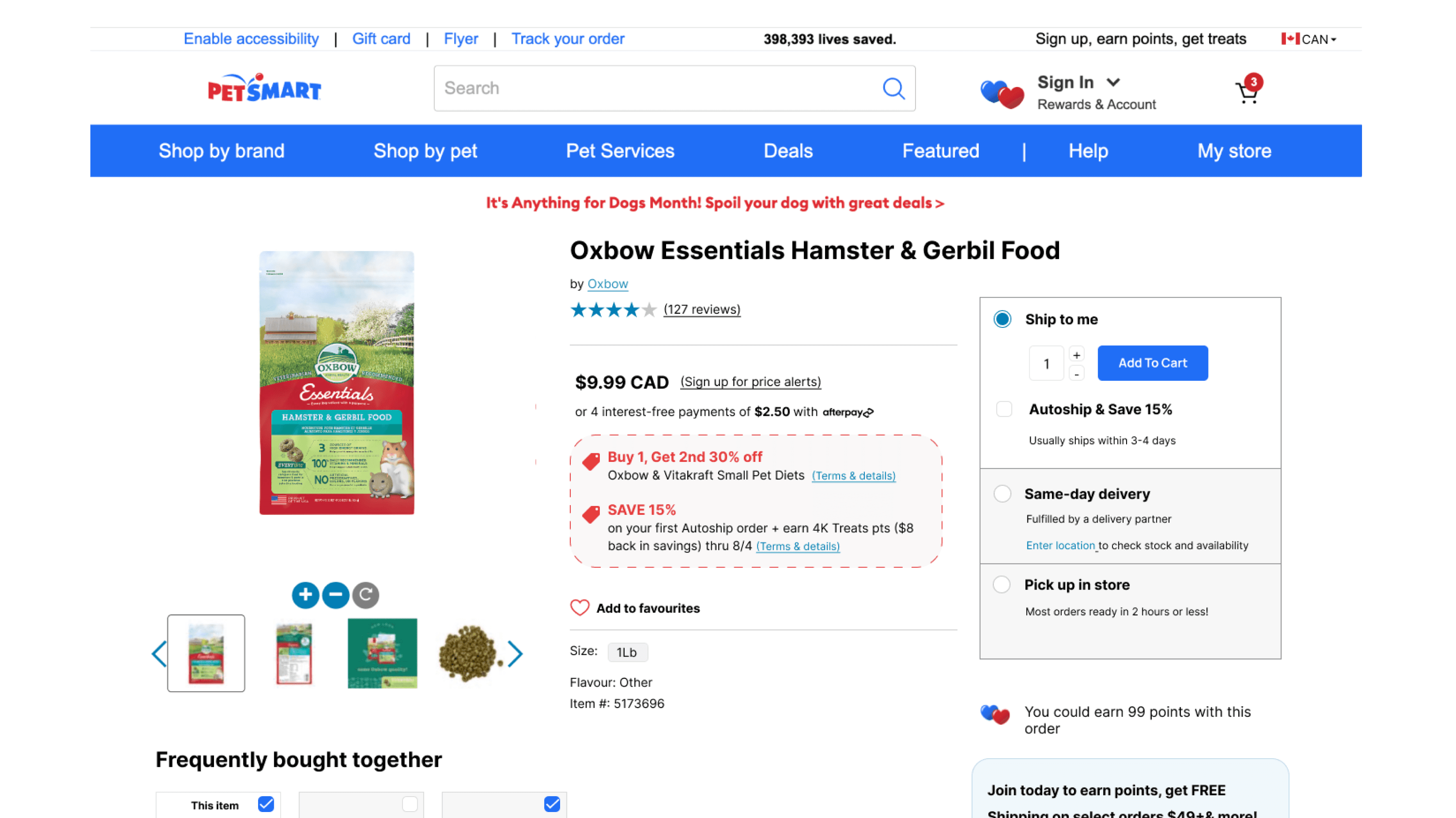
First Iteration
First Iteration
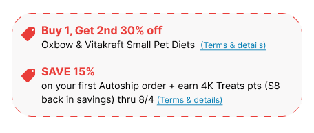
I have tested both version with users - the original design as well as the redesigned product page. The coupon design received the most positive feedback and something users noticed right away. Some participants couldn't even recall if they saw any coupons/promos on the original design. This confirms the original hypothesis that overuse of red colour can actually have the opposite effect instead of the desired emphasis.
Coupons for the Win!
User Testing Insights
User Testing Insights
Oh Canada!
If I see pries listed in CAD, it actually makes me wonder whether they ship from Canada, or elsewhere. Usually to me, it’s an indication that it’s an international site.. because why would you list prices as CAD, if we are in Canada?”
-- Chris, 34 years old, owner of 2 dogs
Initially, I have added a flag icon at the top bar along with "CAD" addition to all prices as indicators for users that they are in fact on a Canadian version of the site. Pet Smart has a US version which has a very similar look and feel, and some users mentioned often confusing the two and only realizing once at the checkout - understandably making it a frustrating experience.
The user testing however, revealed that it might have an opposite effect as this quote suggests.
To account for both of these user perceptions, I have decided to create more visibility to the closest store location. Currently, it is hidden in the navigation bar under My Store. Bringing it out to the main panel, and strategically placing it next to the search button can help to mitigate some of the potential confusion that pricing and flag icons might create for some.
Doordash logo consideration.
To know or not to know?
While some users noticed the Doordash logo in redesign, one user mentioned how his immediate thought was whether that would mean extra delivery costs (including tipping). He admitted that it would be a consideration factor, potentially against this delivery method.
Other two users however raised the concerns over lack of transparency with the original design and mentioned how the difference between Same-Day delivery and Ship to me option is confusing. They weren't sure if that means different shipping companies, or different costs associated with two. The fact that they ship from different places and therefore stock levels might be different weren't clear.
As a result, I have combined this various feedback and opted in for something in middle. Namely, I added text "fullfilled by delivery partner" as clarification that provides transparency but doesn't immediately brings to mind Doordash and associated negatives.
Before
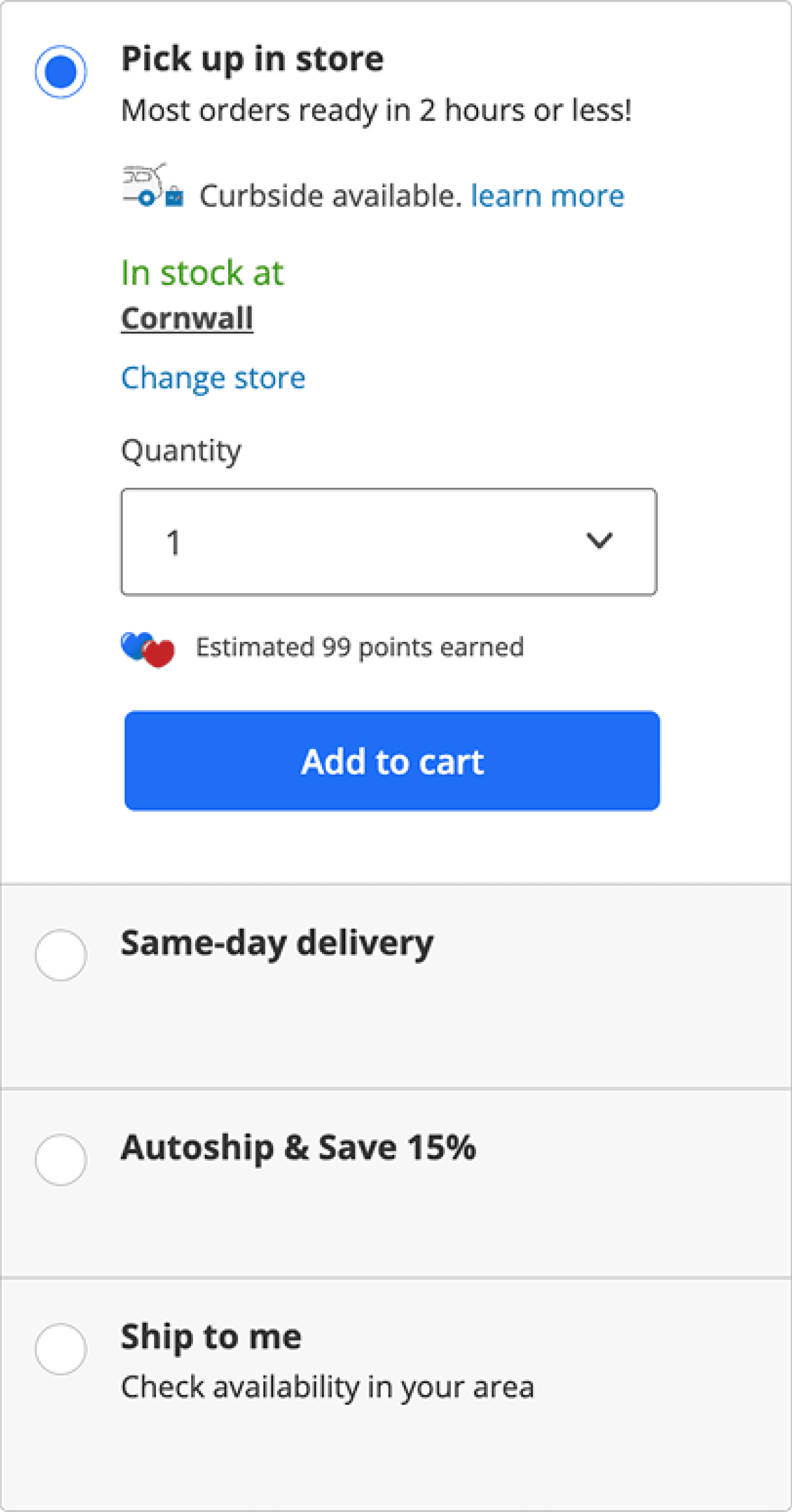
After
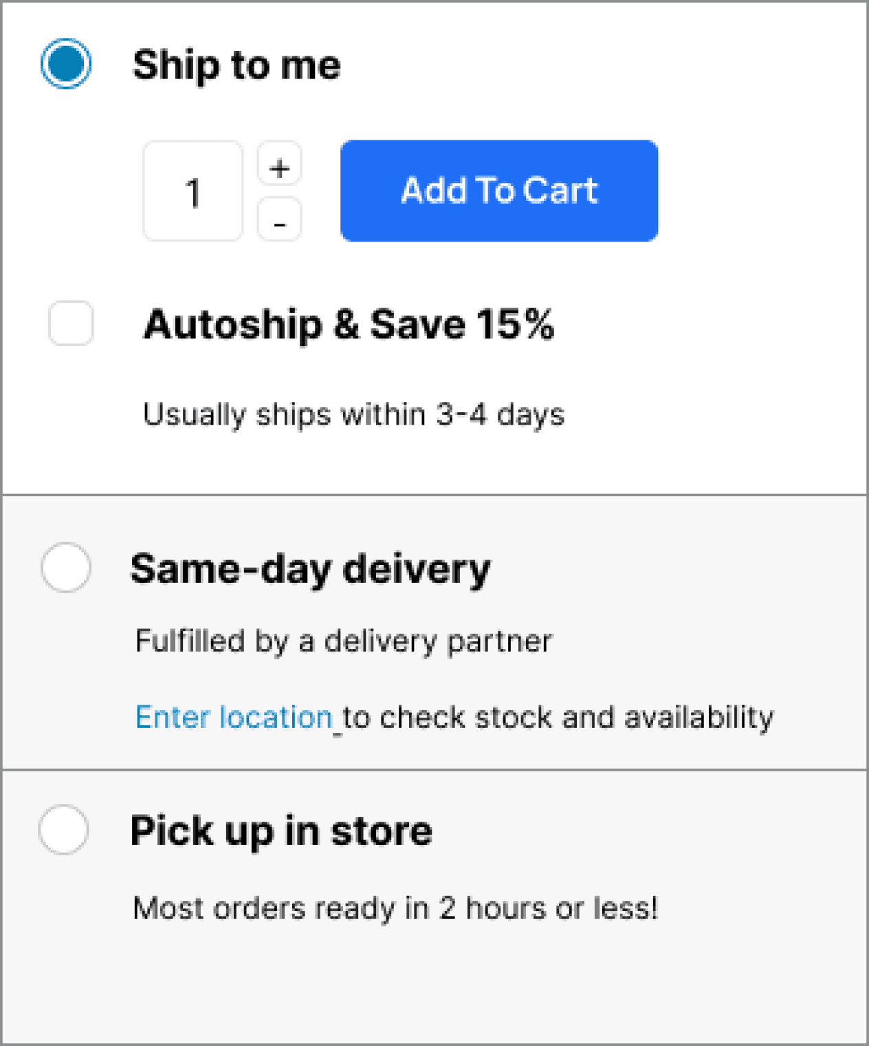
One size fits all?
Before

After
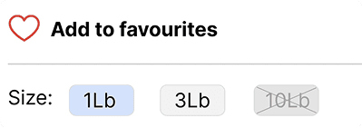
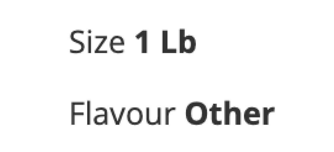
Scenario: the customer knows that the product exists in different sizes. The product page only lists one size, which makes it unclear if Pet Smart doesn’t have alternative size, it is temporarily out of stock or whether it is sold at a different page for that given size.
I have implemented the improved design for size information that ensures visual consistency, whether the product is available in various sizes or only one.
One option was to implement the dropdown that already exists on other product pages however if the product is only sold in one size on Pet Smart, including information about other sizes unavailablity might make it more confusing for the user.
Coupons for the Win!
I have tested both version with users - the original design as well as the redesigned product page. The coupon design received the most positive feedback and something users noticed right away. Some participants couldn't even recall if they saw any coupons/promos on the original design. This confirms the original hypothesis that overuse of red colour can actually have the opposite effect instead of the desired emphasis.

If I see pries listed in CAD, it actually makes me wonder whether thy ship from Canada, or elsewhere. Usually to me, it’s an indication that it’s an international site.. because why would you list prices as CAD, if we are in Canada?”
-- Chris, 34 years old, owner of 2 dogs
Oh Canada!
Initially, I have added a flag icon at the top bar along with "CAD" addition to all prices as indicators for users that they are in fact on a Canadian version of the site. Pet Smart has a US version which has a very similar look and feel, and some users mentioned often confusing the two and only realizing once at the checkout - understandably making it a frustrating experience.
The user testing however, revealed that it might have an opposite effect as this quote suggests.
To account for both of these user perceptions, I have decided to create more visibility to the closest store location. Currently, it is hidden in the navigation bar under My Store. Bringing it out to the main panel, and strategically placing it next to the search button can help to mitigate some of the potential confusion that pricing and flag icons might create for some.
Doordash logo consideration.
To know or not to know?
While some users noticed the Doordash logo in redesign, one user mentioned how his immediate thought was whether that would mean extra delivery costs (including tipping). He admitted that it would be a consideration factor, potentially against this delivery method.
Other two users however raised the concerns over lack of transparency with the original design and mentioned how the difference between Same Day delivery and Ship to me option is confusing. They weren't sure if that means different shipping companies, or different costs associated with two. The fact that they ship from different places and therefore stock levels might be different weren't clear.
Before
Before

After
After

Overall, it felt that the desire for transparency was more important than managing perceptions that might be associated with delivery partner such as Doordash.
I however decided to go with alternative that addresses both of these things, providing transparency but reducing potentially negative perceptions (After User Testing).
One size fits all?
Scenario: the customer knows that the product exists in different sizes. The product page only lists one size, which makes it unclear if Pet Smart doesn’t have alternative size, it is temporarily out of stock or whether it is sold at a different page for that given size.
I have implemented the improved design for size information that ensures visual consistency, whether the product is available in various sizes or only one.
One option was to implement the dropdown that already exists on other product pages however if the product is only sold in one size on Pet Smart, including information about other sizes unavailablity might make it more confusing for the user.
Before
Before

After
After

Design Decisions & Wireframes
One such example is displaying the store information in navigation, which doesn't only quickly let the users know about the Pet Smart's physical presence, but also serves as an orientation point (some users admit to accidentally finding themselves at US website version).
In addition, I have also experimented with different layouts, condensing 2 navigation bars into one, adding more white space and visual cues that signal separation between different sections.
Apart from implementing the feedback from user testing, I have also made a few design decisions to enhance user experience through more intutive and less cluttered interface.
These improvements similarly have significant impact on the conversion rates as they affect users' ability to find the right product and the relevant information for them to complete a purchase.
Version 1
Version 1
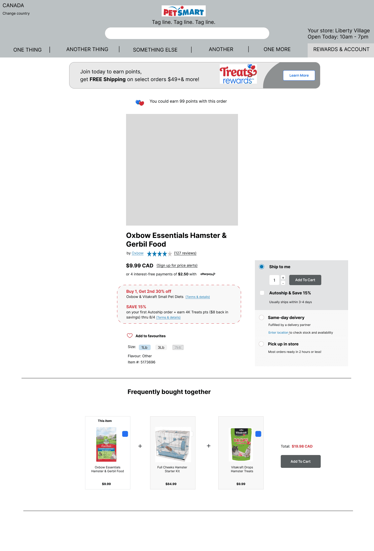
Version 2 (final)
Version 2 (final)

01
01
Adding more white space for visual elevation of a previously very cluttered page.
Given there are a lot of elements and information on the page, proximity doesn't produce the same effect as it would on the page with less information. To remedy some of the run-down sections and information, I experimented with adding a line to create a visual separation.
02
02
Removing 'My store' from the navigation bar and moving it above and displaying additional information such as Location and Hours
Final Version with UI redesign
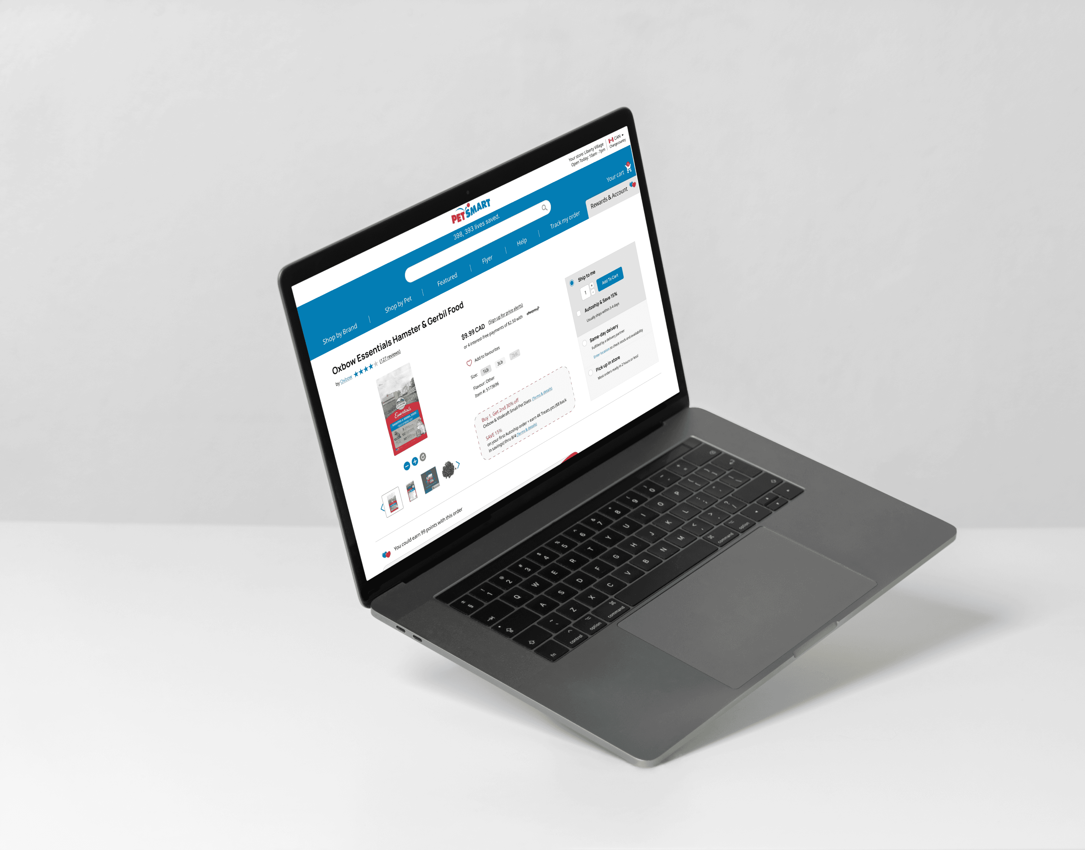
When less is more
This redesign is a perfect example of designing within the limits of the existing interface and potential technical restrictions. Being mindful, that the decisions made by the design team at Pet Smart is most likely a reflection of those technical limitations.
I have tried not to divert too much from the UI and available components, thereby illustrating how small and subtle changes can still make a significant impact on the user experience.
petsmart.ca
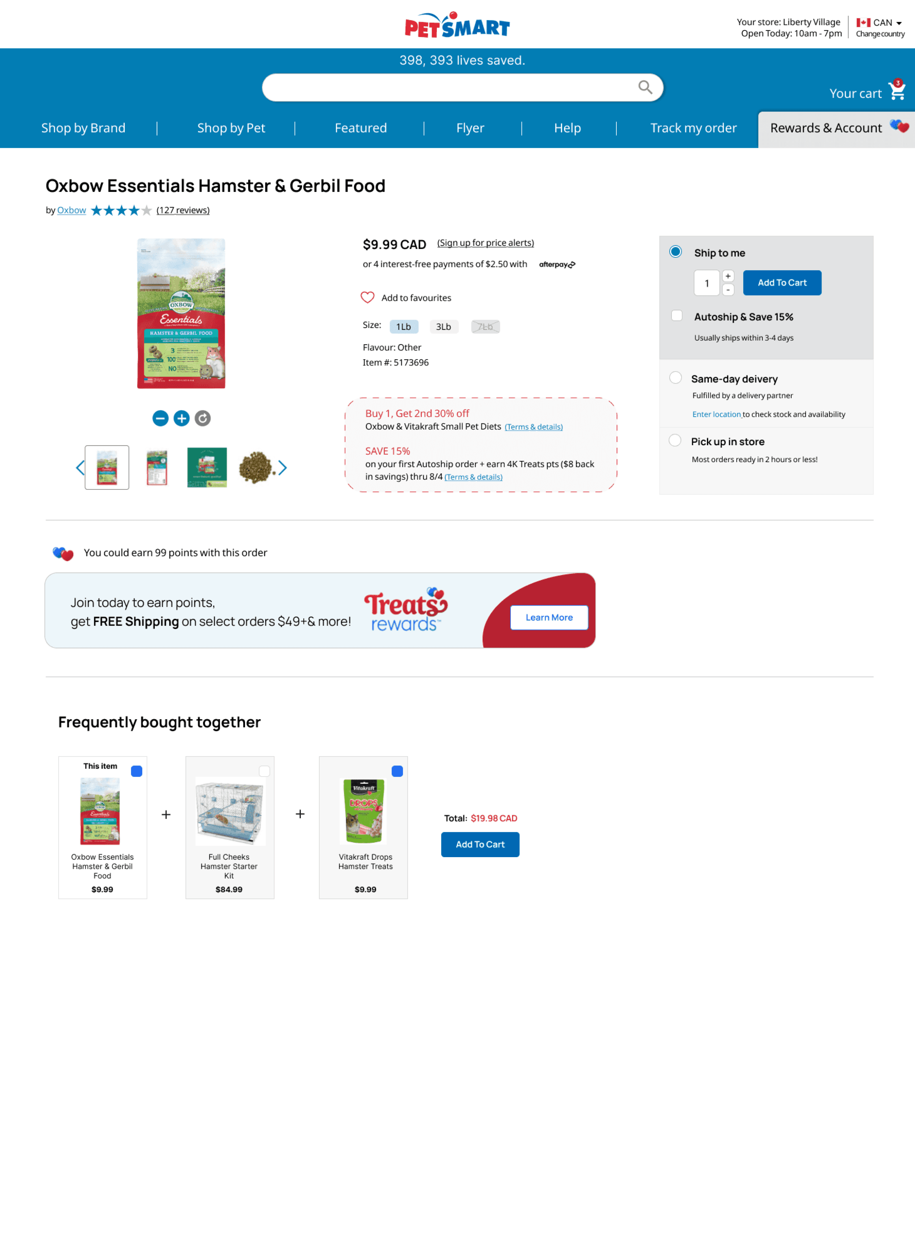
Optimizing navigation bar through elevated UI
Creating two layers of navigation (original design had 3) allow to separate content by function. The first white layer where the logo sits, also features the store locator and language settings. It is both informational - something the user can always quickly reference when browsing through the site but also serves as a setting that user can actively change.
The second blue colour layers encompasses search bar together with the menu items. In the original design, these elements were on separate layers. Reason for grouping them? Because they often sit closely in the user journey map and have some overlapping functions such as 'searching for a product'. Visually, it also presents a more unified look.
Final Version with UI redesign

When less is more
This redesign is a perfect example of designing within the limits of the existing interface and potential technical restrictions. Being mindful, that the decisions made by the design team at Pet Smart is most likely a reflection of those technical limitations.
I have tried not to divert too much from the UI and available components, thereby illustrating how small and subtle changes can still make a significant impact on the user experience.
Optimizing navigation bar through elevated UI
Creating two layers of navigation (original design had 3) allow to separate content by function. The first white layer where the logo sits, also features the store locator and language settings. It is both informational - something the user can always quickly reference when browsing through the site but also serves as a setting that user can actively change.
The second blue colour layers encompasses search bar together with the menu items. In the original design, these elements were on separate layers. Reason for grouping them? Because they often sit closely in the user journey map and have some overlapping functions such as 'searching for a product'. Visually, it also presents a more unified look.
petsmart.ca
petsmart.ca

Projected impact of this redesign
After redesigning the delivery / checkout flow and making the options more transparent (size, shipping, etc.), I estimate improvement in key metrics:
Increase in completion of orders due to clear user flow in selecting a delivery method
Decrease in drop off rates due to transparent and clear options for choosing delivery, size of the product and other relevant information
Less confusion and mistakes in the actual orders as a result decrease in operational costs resolving those problems
5%
uplift in key metrics will bring
=
$76,000 CAD/year
savings in operational overhead (operational costs estimated at 2% of revenue - 76M x 0.02)
$3.8M CAD
of additional revenue (based on annual Petsmart.ca revenue of $76M CAD/year)
This illustrates how even modest UX improvements (5%) can drive not only meaningful user value but also substantial business value for Pet Smart Canada
Reflections

Some research is ALWAYS better than no research
One thing that never stops to amaze me is how much difference user testing makes. If there are budget constraints and time limits, even doing the quick and dirty guerrilla research makes the world of difference. This project was no exception.
User testing opened up my mind to the multitude of interpretations to what initially felt like a straightforward design decision.
In the end, user testing insights helped me to think critically about the initial redesign and identified pain points, and iterate my designs in a way that takes into account the holistic UX experience (including context such as existing perceptions of things like DoorDash delivery service or the meaning of the flag icon for changing the country).
Projected impact of this redesign
After redesigning the delivery / checkout flow and making the options more transparent (size, shipping, etc.), I estimate improvement in key metrics:
Increase in completion of orders due to clear user flow in selecting a delivery method
Increase in completion of orders due to clear user flow in selecting a delivery method
Decrease in drop off rates due to transparent and clear options for choosing delivery, size of the product and other relevant information
Decrease in drop off rates due to transparent and clear options for choosing delivery, size of the product and other relevant information
Less confusion and mistakes in the actual orders as a result decrease in operational costs resolving those problems
Less confusion and mistakes in the actual orders as a result decrease in operational costs resolving those problems
5%
5%
uplift in key metrics will bring
=
=
$76,000 CAD/year
$76,000 CAD/year
savings in operational overhead (operational costs estimated at 2% of revenue - 76M x 0.02)
savings in operational overhead (operational costs estimated at 2% of revenue - 76M x 0.02)
$3.8M CAD
$3.8M CAD
of additional revenue (based on annual Petsmart.ca revenue of $76M CAD/year)
of additional revenue (based on annual Petsmart.ca revenue of $76M CAD/year)
This illustrates how even modest UX improvements (5%) can drive not only meaningful user value but also substantial business value for Pet Smart Canada

Reflections
Some research is ALWAYS better than no research
One thing that never stops to amaze me is how much difference user testing makes. If there are budget constraints and time limits, even doing the quick and dirty guerrilla research makes the world of difference. This project was no exception.
User testing opened up my mind to the multitude of interpretations to what initially felt like a straightforward design decision.
In the end, user testing insights helped me to think critically about the initial redesign and identified pain points, and iterate my designs in a way that takes into account the holistic UX experience (including context such as existing perceptions of things like DoorDash delivery service or the meaning of the flag icon for changing the country).
Looking for a similar uplift to your website?
Looking for a similar uplift to your website?
Looking for a similar uplift to your website?


A few things I can help with
A few things I can help with
Comprehensive UX audit, breakdown of the current state of your website/product
Comprehensive UX audit, breakdown of the current state of your website/product
Comprehensive UX audit, breakdown of the current state of your website/product
Identification of the most critical user pain points with the maximum impact for CRO
Identification of the most critical user pain points with the maximum impact for CRO
User flow targeted redesign
User flow targeted redesign
User testing of existing and proposed solutions
User testing of existing and proposed solutions
Compehensive competitor analysis
Compehensive competitor analysis
Identification of your USP, and USP-based optimization of UX
Identification of your USP, and USP–based optimization of UX

©2025 - Anna Aksenovich
Case studies
©2025 - Anna Aksenovich
Case studies
©2025 - Anna Aksenovich


